Friday, November 26, 2010

Thanksgiving and getting

Thanksgiving is an almost uniquely American holiday. (I know there is a Canadian version but this weekend I will follow US tradition by putting that aside.) It celebrates a time in the 1620s when this country's immigration policy was not only one of open borders but of active assistance to immigrants. This is just as well because the immigrants to the US from Europe during that time would have been stuffed without help from local inhabitants. Thanksgiving celebrates that help although it is not lost on anyone that US immigration policy is now considerably different, I suspect for historical reasons, perhaps recalling that open immigration perhaps didn't work out so well for past inhabitants.

Nonetheless, it was clear that in the 1620s, it was food that was a core issue for new settlers. For that reason, every year, US families gather together to prove to everyone that food is no longer an issue. And yesterday we joined one such family for what we understand to have been a dinner combining every single tradition within a modern suit as is humanly possible.

Like Halloween, Thanksgiving had received some hype for our kids. Our respective children had played together for a year. They had been told that their grandparents house, where our event would take place, was a house of wonder where there was candy and toys literally in every corner. Our children were sceptical and given some Halloween disappointments, expected a good meal, but nothing to write home about. In this case, the myth turned out to be the reality.

This was a house that did not like taxes and one tax that had been identified as evil was my health tax -- re-dubbed the 'candy tax.' Soon upon entering our kids were told that in this house the candy tax had been repealed. Not only that but candy was freely available. It was everywhere. Lollipop displays, bowls of M&M's and some Swedish red fish that now rates in their eyes as one of the greatest culinary creations in human history. To wit, when a discussion turned to what people might have as a last meal my daughter resolutely stated her menu of "chocolate, Ben and Jerry's ice cream and those red fish." I could see my son looking around in wonder and then feeling the walls to see if they were made of gingerbread. 

But it wasn't only that, there was also the toys. There were toys everywhere. These were grandparents who in no uncertain terms were going all out. (And not just in toys but in attire. The grandmother was dressed as a pilgrim and the grandfather had a roast turkey adorning his head). Months of investment going around yard sales and discount shops had paid off. The toys were stacked many feet high. Our kids didn't know what to do next. They could do no more than frolic around with the distinct impressions that dreams can indeed come true. "I can't believe it. It is exactly what they said it would be."

And the house itself was a pure delight. The walls were covered with memorabilia. It could have been a museum to well, museum shops. Every room had a theme. From the revolution to broadway to a hunting lodge and then a bathroom where every wall was a mirror, including the ceiling and right down to the light switches (see photo). You could see yourself drifting a thousand times over in all directions. Going there is quite an experience.

Suffice it to say, this was one situation in which engaging in any type of what might be called parenting was futile. So we didn't. As it turned out, the children were not the only ones who would be saved from starvation. We too were seduced by the red fish but then the adults were presented a meal that actively sought to destroy any pretense for restrained living with course after course of mash potatoes, assortments of pies and a turkey whose size would have required a trained game hunter to have brought down. It is just as well we didn't have to attend to the children as it was not really possible to move. It was quite a feast and then they brought out dessert.

Eventually, much to our surprise, it was one of the native grandchildren who succumbed first to the unrestrained consumption. He knew it was coming and, with full cheeks, was ushered into the bathroom by one of his parents. One can only imagine that scene as several thousand kids simultaneously 'tossed their cookies.' By the look of his parent upon exiting, this is a dream-like fantasy that could have been spared reality.

My children eventually collapsed from exhaustion but kept their load. Our fears that they might not fall asleep were unfounded. And then next morning, much to our amazement they wanted to eat breakfast. On time and as usual. We offered them vege sticks. They didn't eat.

It is interesting to speculate why Thanksgiving has grown in popularity over the years. These days it has been combined with another past time, shopping, although for the life of my I can't understand how and why people would rise themselves today to get to the shops by 4am. If there is a greater example of market unraveling I haven't seen it.

But in looking around this family gathered all in one place from afar with the knowledge that half of them were away from their families, I think the holiday may be a negotiated consequence of duality. In the US, where so many families live in different cities, Thanksgiving allows one family gathering to be allocated while I guess at Christmas or another occasion, the other side of the family gets together. It provides the extra holiday so that in each family both sides can have their piece of the action. It is a market response to a fundamental scarcity of allocating members to large, annual family gatherings. We were happy on this occasion to be part of this one.

Wednesday, November 24, 2010

Tech Feature: Terrain textures

I have finally finished the part of the terrain rendering that I spent most time researching and thinking about: texturing. This is a quite big problem, with many methods available, each having its own pros and cons.

I was looking for something that gave a lot of freedom for the artists, that was fast and that allowed that the same algorithm could be used in both game and editor. The last point was especially important since we had much success with our WYSIWYG-editor for Amnesia, and we did not want terrain to break this by requiring some complicated creation process.

Even once I started working on the textures, I was unsure on the exact approach to take. I had at least decided to use some form of texture splatting as the base. However there is a lot of ways to go about this, the two major directions being to either do it all in real-time or to rendering to cache textures in some manner.

Before doing any proper work on the texturing algorithm I wanted to see how the texturing looked on some test terrain. In the image below I am simply project a tiling texture along the y-axis.


Although I had checked other games, I was not sure how good this the y-axis projection would look. What I was worried of was that there would be a lot of stretching at slopes. It turned out that it was not that bad though and the worst case looks something like this:

While visible it was not as bad as I first thought it would be. Seeing this made me more confident that I could project along the y-axis for all textures, something that allowed for the cached texture approach. If I did all blending in real-time I would have been able to have a special uv-mapping for slopes, but now that y-axis projection worked, this was no longer essential. However, before I could start on testing texture caching, I need to implement the blending.

The plain-vanilla way to do is, is to have an alpha texture for each texture layer and then draw one texture layer after another. Instead of having many render passes, I wanted to do as much blending in a single draw call. By using a an RGBA texture for the alpha I could do a maximum of 4 at the same time. I first considered this, but then I saw a paper by Martin Mittring from Crytek called "Advanced virtual texture topics" where an interesting approach was suggested. By using an RGB texture up to 8 textures could be blended, by letting each corner of an rbg-cube be a texture. A problem with this approach is that each texture can only be nicely blended with 3 other corners (textures), restricting artists a bit. See below how texture layers are connected (a quick sketch by me):

Side note: Yes, it would be possible to use an RGBA texture with this technique and let the corners of a hyper cube represent all of the textures. This would allow each texture type to have 4 textures it could blend with and a maximum of 16 texture layers. However, it would make life quite hard for artists when having to think in 4D...

When implemented it looks like this (note he rgb texture in the upper right corner):


However, I got into a few problems with this approach, that I first thought where graphics card problems, but later turned out to be my fault. During this I switch to using several layers of RGBA textures instead, blending 4 textures at each pass. When I discovered that is was my own error (doh!), I had already decided on using cache textures (more on that in a jiffy), which put less focus on render speed of the blending. Also this approach seemed nicer for artists. So I decided on a pretty much plain-vanilla approach, meaning some work in vain, but perhaps I can have use for it later on instead.

Now for texture caching. This method basically works as the mega texture method using in Quake Wars and others. But instead of loading pieces of a gigantic texture at run-time, pieces of the gigantic texture is generated at run-time. To do this I have a several render textures in memory that are updated with the content depending on what is in view. Also, depending on the geometry LOD I use, I vary the texture resolution rendered to and make it cover a larger area. So texture close to the view use large textures and far away have much lower.

I first thought had to do some special fading between the levels and was a bit concerned on how to do this. However, it turned out that this was taken care of the trilinear texture filtering quite nicely (especially when generating mipmaps for each rendered texture). When implemented the algorithm proved very fast as the texture does not have to be updated very often and I got very high levels of detail in the terrain.

Side note: The algorithm is actually used in Halo Wars and is mentioned in a nice lecture that you can see here. Seeing this also made me confident that it was a viable approach.

The algorithm was not without problems though, for example the filtering between patches (different texture caches) created seams, as can be seen below:

(click to enlarge, else it will not be seen)

The way I fixed this was simply to let each texture have a border that mimicked all of the surrounding textures. While the idea was simple, it was actually non-trivial to implement. For example, I started out with a 1 pixel border, but had to have a 8 pixel border for the highest 1024x1024 textures to be able to shrink it. Anyhow, I did get it working, making it look like this:

(Again, click image to see full size!)

Next up was improving the blending. The normal blending for texture splatting can be quite boring and instead of just using a linear blend I wanted to spice it up a bit. I found a very nice technique for this on Max McGuire's blog, which you can see here. Basically each material gets an alpha that determines how fast each part of it fades. The algorithm I ended up with was a bit different from the one outlined in Max's blog and looks like this:

final_alpha = clamp( (dissolve_alpha- (1.0 - blend_alpha ) / (dissolve_alpha * (1-fade_start), 0.0, 1.0);

Where final_alpha is used to blend the color for a texture and fade_start determines at which alpha value the fade starts (this allows the texture to disappear piece by piece). blend_alpha is gotten from the blend texture, and dissolve_alpha is in the texture, telling when parts of the texture fades out.

So instead of having to have blending like this:


It can look like this:


Now next step for me was to allow just not diffuse textures, but also normal mapping and specular. This was done by simply rendering to more render targets, so each type had a separate texture. This would not have been possible to do if I had blended in real-time as I would have reached the normal limit of 16 texture limits quite fast. But now I rendered them separately, and when rendering the final real-time texture I only need to use a texture for each type (taken from the cache textures). Here is how all this combined look:

You can see small version of each cache texture at the top.

Now for a final thing. Since the texture cached are not rendered very often I can do quite a lot of heavy stuff in them. And one thing I was sure we needed was decals. What I did was simply to render a lot of quads to the textures which are blended with the existing texture. This can be used to add all sorts of extra detail to map and almost require no extra power. Here is an example:


I am pretty happy with these features for now although there are some stuff to add. One thing I need to do is some kind of real-time conversion to DXT texture for the caches. This would save quite a lot of memory (4 - 8 times less would be used by terrain) and this would also speed up rendering. Another thing I want to investigate is to add shadows, SSAO and other effects when rendering each cache texture. Added to this are also some bad visual popping when levels are changed (this only happens when zooming out a steep angle though) that I probably need to fix later on.

Now my next task will be to add generated undergrowth! So expect to see some swaying grass in the next tech feature!

Monday, November 22, 2010

How the player becomes the protagonist

Introduction
In Amnesia one of the main goals was for the player to become the protagonist. We wanted the player to think "I am" instead of "Daniel is" and in that way make it a very personal experience. The main motivation for this was of course to make the game scary, but also for the memories that were revealed to feel more personal for the player.

In this post I will go through some of the design thinking we used, problems it caused and how it eventually turned out. I will also briefly discuss the future of this sort of design.


Playing a role
First of all, it is not required that the protagonist matches the player character in order for the player to "become" him/her. As an extreme example, I see no problem with a game featuring an animal as lead character to have the player become the protagonist. The idea is not that the player should match the physical / mental protagonist, but rather that he/she should be able to roleplay him/her and to feel like really being him/her.

There is of course limits to this kind of roleplaying and certain characteristics might make it impossible for a player to feel a connection. This is the same for works in other media where the reader/viewer is meant to feel empathy toward one or more characters. Sometimes there is some mismatch that removes this feeling, and much of the work's power is lost. Note that this sort of friction is more likely to happen because of the personality of the character and not so much because the physical appearance. A simple example of this would be that protagonists in Disney movies are often very easy to relate to despite being animals.

Considering this, the general rule that we used was not to force emotions and actions that players were unlikely to accept. When the protagonist is displayed as doing or feeling something, we had to make sure that player could agree to this.


Getting into the act
In film or literature it is possible for the audience to not like the protagonist at the start, but then make them feel a connection over the course of the work. This is not possible to do in a videogame, as players must start acting out their role as soon as the game starts. If the situation does not feel comfortable at the start, then it will be very hard to connect.

Because of this, videogames need to have a tutorial of some sort where the player gets used to the idea of playing a certain character. During this phase it is also important that the player learns how to act as the protagonist, so they later act accordingly. I do not think this can be done solely on a mechanics basis, as the trial and error involved will most likely just frustrate. This is largely dependent on the space of actions available though and sometimes players will quickly realize the role they are meant to play.

In Amnesia we made the choice to be very upfront on what is expected by the player. This is accomplished by displaying messages before the game starts, telling the player what to do. The main message was a rather simple one, simply saying that the player should not try and fight any monsters. As this is pretty close to what most people would do in real-life, we basically just had to tell players that the game was not a first-person-shooter and the rest came naturally. If the game would have required more specific behavior from the player, more info might have been needed.

Once the player accepts this role and is ready to play, the next step is to provide an interface between the player and world. Here a bunch of problems arises and it becomes less clear what is the right thing to do.


What emotions to hide?
First of all, we decided to remove any form of cut-scene from the game. Upon entering a cut-scene, there is a large distinction between the kind of control a player has during normal play, creating a discrepancy that weakens the player-protagonist connection. In our previous effort, Penumbra, we had little of these, but there were still places when control was taken from the player for longer periods. In Amnesia, we only used very short "view hijacks" to display points of interest. These were not very frequent and were meant to be seen as reflexes, which seemed to be accepted for most players. Some were a bit annoyed by them though and we are not sure they were that necessary.

Next thing we decided on was that, unlike Penumbra, Daniel (the protagonist) should never comment on the situation. In Penumbra the most obvious place this happens is when a spider is spotted and the text "A spider! I do not like spiders" appear. This sort of interface where the protagonist make subjective remarks on the game world can very easily break the connection between player-and-protagonist.

We tried to skip descriptive texts completely, but this caused problems when dealing with puzzles. If players start thinking about a puzzle "incorrectly", then it is imperative that they get on the right track. In these cases, the easiest (and many times only) way to communicate this to the player is by using texts. We tried to add as many solutions to avoid having texts, but it only works so far, and eventually some kind of explanatory / hinting text was needed. If not the player would have gotten stuck instead and we thought this would be worse than having the texts. In order to keep the player-protagonist connection, we kept all of this texts very objective and impersonal, careful to not force emotions on the player.

Side note: A problem we had when removing subjective comments was the hints were much harder to write. Not being able to let the protagonist guess, use insights or personal knowledge proved quite tricky at times.

We did not remove all of the subjective protagonist emotions though. We kept the more autonomous physical actions such as panting and heart beats, a choice that proved slightly controversial. After releasing the teaser video some people argued that having these sort of reactions pulled them out of the experience. Others felt that it just heightened the experience. Once the game was released, the main complaint came at a very specific feature, namely the "sanity damage"-reaction (that happens whenever the player witnesses something frightening). In the end, we estimate that something like 15-30% of the players disliked these kind of effects.

For the people that did not dislike these effects, many felt it increased the connection to the protagonist. For example feeling as if their own heart beat faster when the protagonist's did or becoming startled when a "sanity damage"-effect told them to. This is a really interesting subject and while using these kind of effects might detract the experience for some, I think it might be worth taking the risk. So far we have mostly tried this for very simple situations, but I believe it can used to evoke much more complex emotions.


Bringing back memories
An important part of Amnesia is that players slowly learn the background of the character they are playing. As the name suggest, the game starts out with the protagonist having amnesia that sets the player and protagonist on equal footing. By progressing through the game both the player and the protagonist gain access to increasingly more lost memories, slowly getting an idea of how Daniel ended up in the situation he currently is in.

The main mechanic we used to deliver these lost memories was through diary entries scattered throughout the game. We decided to voice these in order for them to be more interesting, but I think this backfired a bit. What many players seem to have experienced was that Daniel was reading the entries aloud. Thus this proved to be a large distraction and must have weakened the player-protagonist bond for many. What we intended was for the player to hear Daniel's voice as the voice of their old self. This was probably way too obscure though and it might have been better to just had them as pure text.

Added to this was the fact that Daniel actually spoke at some points. Some lines are spoken during the start of the game and some during gameplay if sanity is too low. Again, this was intended to be lost memories, but many players did not perceive it as such and instead thought it was strange to hear Daniel talking.

As mentioned earlier, we wanted the player to feel as if the lost memories were their own. But because of the way the memory content was delivered I think the effect was not what it could have been.


Dialog
A major obstacle when trying to create strong a player-protagonist connection is that one often end up with the so called "silent protagonist". The reason for this is simply that that whenever spoken words are required, the lines spoken by the protagonist must be predetermined and chosen for the player. Either, the character simply speaks a scripted line or the player chooses from a list canned responses. Using the first type allows for more fluent conversation but removes any interaction. The second choice provides some interaction but makes conversations stiff (as other actions are only possible when in "dialog mode") and might lack options the player finds appropriate to say. Some hybrid solutions exist (like in Blade Runner where the player just sets an attitude) but the problem still remains.

Side note: Interestingly, the problem is quite opposite in Interactive Fiction. Instead of lacking options for the player, the characters one speaks to lack the intelligence to understand all possible (and fitting) sentences.

So how to solve this? Well, first of all it is worth noting that the systems mentioned above can still be used if applied carefully. If the player's emotions are in line with the protagonist's then simply having short scripted lines could work very fine. To make this work I also think it is important that the protagonist's voice is a recurring element of the game to get the player used to it. If it just pops up on rare occasions, the illusion is easily broken. Call of Cthulhu and the Thief series use this to some success (I think it is at its best when short, in-game and the player is free to do other actions at the same time).

The multiple choice system is also possible to use, but I think it comes with more problems. The biggest is that since the player gets a choice it is more obvious when the game does supply the wanted action. With other actions such as walking and fighting, it is easier to set up rules for the player on what is allowed and not. Conversations have a much wider scope and it is much harder to keep it consistent. It is also much harder to display the options in a way that feels okay. Unless they entire game is controlled with a menu-like system, having a menu pop up for a specific action is very distracting.

In Amnesia we chose to avoid conversations as much as possible and there are only two occasions when you meet another character face-to-face. And in only one of these were there any real opportunity for a conversation (with a tortured man called Agrippa). The way we went about it was for Daniel to be silent, but for Agrippa to respond as if Daniel had spoken. This gave the dialogs (or rather monologue) more flow but many players found this quite disconnecting. They found it strange that Daniel silently spoke back, especially as many was sure they had heard him speak before when reading diaries. On the other hand, it might have been even more strange if Agrippa had never asked Daniel anything and simply just spoken in direct orders or in a lecturing manner. Agrippa was put into game pretty late in development and we did not gave it as much thought as we should have, so this might have been solved better.

When creating a videogame with a strong player-protagonist connection, the best option is probably to fit the game world around a protagonist that does not require none or very simple (as in yes-no or simple vocabulary) speech. This way, the player-protagonist connections is more easily kept and consistency is maintained. An example of this is System shock where all characters are dead or talking through a one-way radio. Another example is BioShock 2 where the protagonist is a dumb robot that is not expected to speak. This of course put limits on what kind of experiences that can be made, but might be the only way to create a strong player-protagonist experience.


Problems to overcome
It is not only dialog that is a large problem when trying to make player and protagonist one and the same. Since we are trying to craft an experience where the players themselves are a central ingredient, much pressure is put on them.

A major problem is that it is hard to let the protagonist have any special knowledge. This is a reason why stories starring amnesiacs, outsiders or cannon-fodder are so common; things becomes very complicated if players need to have a deeper understanding of their surroundings. A way to solve this is to force the player into learning things before starting the game. But since reading a novel before starting the game is not really possible, the amount of information that can be given is quite limited. Another way to solve this is to have some sort of tutorial texts popping up, but this is of course very distracting.

Another issue, is that the player and protagonist might not share the same goals. For instance the protagonist might be out for revenge, but the player might not be interested in this. This makes games of this type end up with fairly simplistic motivations. It might be possible to give some kind of instructions before the game starts, but that does not seem very good to me. Better would be to provide an experience at start that sets up the player's mood to match the protagonist's. This is easier said than done though.


Why bother?
So why go into all of this trouble of making blurring the line between player and protagonist? For one thing, I think it is something that is extremely interesting to explore. So far games that try to create strong player-protagonist bonds are mostly about killings things and exploration into other themes is pretty much uncharted.

Secondly, it is something that that is unique to the medium. In no other media can the audience step into works of art themselves. And just because of this I think it demands to be experimented with. Instead of looking too much to film or other art as inspiration, we should try and do things in ways that only videogames can.


Your thoughts?
We would be very interested in hearing your thoughts on this. How did you feel like you connected with the protagonist in Amnesia? Was there any especially large obstacles for you to have a strong connection?

Also, in case you are interested in more discussions on this, check out the previous post on self-location in games:
http://frictionalgames.blogspot.com/2010/09/where-is-your-self-in-game.html

Saturday, November 13, 2010

Soccer Parenting

So due to massive peer pressure at school -- all the girls in Grade 1 were doing it -- my 6 year old has been 'playing' soccer of a Saturday morning for the past couple of months. I, say, 'playing' because from my, albeit fairly limited, viewing of the festivities she was involved in precious little of what might be called 'playing' by sports authorities. Today was the last game and in the hope of using my great parental presence to encourage more playing rather than 'playing' I spent an hour in the cold at the side of a muddy field.

The game started off hopefully enough when my daughter, contrary to many previous occasions where she has just stood in the middle of the field waiting to be substituted out so she could stand at the side of the field, ran around. I'd like to say that she ran in the direction of the ball but that would have been asking quite a lot as she was not really looking at where the ball was. In her case, it was at the feet of a gigantic player from the other team and streaking away from their goal. Suffice it to say, the ability for the other side to score many goals was a team effort. They went towards the goal and most of the players on my daughter's team preferred to stay out of their way.

Sports authorities would no doubt characterise their performance as undisciplined. However, that would be taking a rather narrow view of the proceedings. For instance, my daughter engaged in a very disciplined performance of part of what I guess was the Nutcracker ballet. This was great news because during her dance classes she appears to act more as if she is kicking imaginary balls than dancing. Something was coming together even if out of school activities were somewhat out of sync.

Now it is at this point that you might be wondering what the economist in me was thinking, and could probably guess quite correctly. What this needed was some good old-fashioned incentives. Alas, I am sensible enough to try and keep these things firmly within the home lest I offend some sensible parent out there. Fortunately for me there was another parent without such shame. He offered anyone who scored a goal on my daughter's team, a donut. Faced with the oranges we had brought, this got their attention. I, of course, supported the move but it was clear to me that a myriad of unintended consequences could arise. For starters, there would be little reason for team playing, passing and the like. And then there was the issue that surely defending their goal against the giants on the other side would be worthwhile. And we can go on and on. Nonetheless, it perked up my interest so I kept my objections to myself.

You are perhaps hoping at this point that more goals were scored by our side. Alas that was not to be. To be sure, incentives were part of the reason for a lack of playing. Unfortunately, correcting that only exposed the other issue, a skill deficit. Nonetheless, the ball seemed to be spending a healthy amount of time in the better side of the field, so much so that we parents migrated towards the centre so we could see more of the action. On many dimensions one would categorise that as a success. However, it also revealed that perhaps our team's on field behaviour was an entirely rational response given what they would otherwise bring to the table.

Indeed, there is a final piece of evidence to that effect. When the final whistle blew and the players started to leave the field, my daughter saw her opportunity, got a hold of the ball and started streaking towards the goal with a donut firmly in her sight and no obstacles in her way. Alas, she missed but I admired the last ditch effort. That said, I'm not sure the other parent would have awarded her the only donut on that basis but fortunately, that was a legal dispute we didn't have to enter into.

Soccer is now over and I think this is also it for my soccer parenting days too. I am grateful for the taste of that life that so absorbs many other parents but I am also pleased that I will be spending Saturday mornings this winter firmly indoors.

Update: Then again ...

Monday, November 8, 2010

Tech Feature: Noise and Fractals

Introduction
Now that I have a working algorithm for terrain rendering, I wanted to try making some of it procedurally. This would not be used in order to generate levels, but instead to help artists add some extra detail and perhaps for some effects. The natural world is very noisy and fractal place, so in order a to get a nice looking environment, these two features are crucial.

Noise
When doing noise for natural phenomena, one normally wants some kind of coherent noise. Normal white noise, when nearby pixels are not correlated in any way, looks like this:

This is no good when one wants generate terrain and the like. Instead the noise should have a more smooth feel to it. To get achieve this, one fades between different random values, creating smooth gradients. A way to do this is to generate a pseudo-random number (pseudo because a certain coordinate, will always return the same random value) for whole number points, and then let the fractional parts between these be interpolations. For example, consider the 1D point 5.5. To get the value for this coordinate the pseudo-random values for 5 and 6 are gotten. Lets say they are 10 and 15. These are then interpolated and since 5.5 lies right between them, it is given the value 12.5 ( (10+15)/2 ). This technique is actually very similar to image magnification, where the whole numbers represent the original pixels.

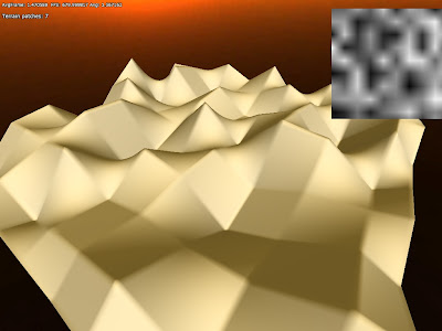
Generating random numbers this way, something like this is gotten:


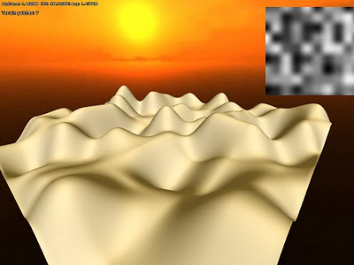
This looks okay, but the interpolations are not very smooth and looks quite ugly. This can be fixed by using a better kind of interpolation. One way to to do this is using cosine-interpolation, which smoothen the transition a bit.

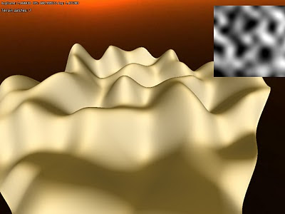
This looks a lot better, but the height map image still looks a bit angular, and not that smooth. However, we can smooth it even further by using cubic interpolation. This ties nicely into the image magnification analogy I made early as cubic is a common type of filter for that. It works by not only taking into account the two points to blend between, but the points next to them as well. In our above example this would be the points 4 and 7 (which are next to 5 and 6). It looks like this:


This gives a much smoother appearance, but it (as well as the other algorithms above) has some other problems. Because the height values for each whole pixel are completely random, it is gives a very chaotic impression. Many times one wants a more uniform look instead. To fix this something called Perlin noise is used. What makes this algorithm extra nice is that it based on gradients instead of absolute values for each pixel. Each whole pixel is assumed to have the value 0, and then a gradient determines how the value changes between it and a neighboring pixel. This allows it to be much more uniform look:


Because of it is based on gradients, it also makes it possible to take the derivative of it, which can be used to generate normal maps (something I am not using though). It is also quite fast, pretty much identical to the cosine interpolation. The cubic interpolation, which requires more random samples, is almost twice as slow.


Fractals
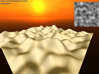
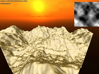
Now that a coherent noise function is implemented it can be used to generate some terrain. The screens above does not look that realistic though and to improve the look something called Fractal Brownian Motion can be used. This is a really simple technique and works, like all fractals, by iterating an algorithm over and over. What is iterated is the noise function, starting off with a large distance between the whole pixel inputs (low frequency) and then using smaller and smaller distances (higher frequency) for each iteration. The higher the frequency the smaller the influence, resulting in the low frequency noise creating the large scale features and the high frequency creating the details.

The result of doing so can produce something like this:


Suddenly we get something that looks a lot more like real terrain!

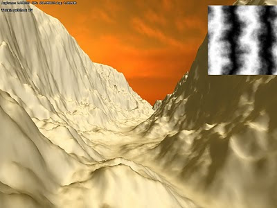
There is lots of stuff that can be done with this and often very simple alteration can lead to interesting results. Here is some iterated fractal noise that as been combined with a sine-function afterwards:


End notes
There is a lot more fun stuff that can be done using noise and I have just scratched the surface with this. It is a really versatile method with tons of usages for graphics. The problem is that that it can be quite slow though and my implementation will not be used for any real-time effects. However, Perlin noise can be simulated on the GPU, allowing it for realtime usage, and this is something I might look into later.

Next up is the hardest part of the terrain rendering - texturing! I am actually still not sure how to do it, but have tons of ideas. Can never get enough of info though, so if anybody know any good papers on terrain texturing, please share!

Banning Happy Meals

I have a post up on HBR Blogs today expressing skepticism that banning toys in fast food meals will actually reduce the quantity of fast food consumed.

Sunday, November 7, 2010

Putting yourself in the shoes of the bad: MegaMind

I was reluctant to take the kids to see MegaMind. For one, it was in 3D. For another, it was the second animated movie of the year told from the perspective of the evil mastermind. The other was Despicable Me which was fine but somewhat predictable. Suffice it to say, my expectations were low.

That being said, I am happy to report that MegaMind got itself an "exceeds expectations" evaluation in my book. The story is told from the perspective of the evil mastermind, MegaMind. But the back story was a not too subtle hit on the age-old 'nature versus nurture' debate. MegaMind starts off in exactly the same shoes (albiet with a different skin colour) as his eventual nemesis MetroMan. They escape a planet -- Superman style -- land on Earth with MetroMan landing in a comical life of privilege while MegaMind lands literally in prison where he remains until he is fortunate enough to attend the very same gifted school as MetroMan. MegaMind stuggles socially and with continual bad luck while MetroMan does not. MegaMind, after an heroically long period of misfortune, decides to through in the towel and trying to be good and becomes evil. That, as it turns out, brings him a relatively fulfilled life but as you can imagine with such existential underpinnings, something is amiss and he doesn't work it out until some life changing events occur. 

I won't tell you more of the plot here suffice it to say that (a) it wasn't silly and made sense and (b) you actually wanted to find out what happens. That puts it right up there in the kid-movie stakes. Throughout, without trying too hard, is a ton of 'adults will only get it' referential humour and, indeed, in this theatre, the adults laughed loudest.

One final amusing bit. A commercial came on prior to the movie showing young girls asserting that they "can be whatever they want to be." At the end of it we found out it was a commercial for Barbie eliciting the biggest groans throughout the audience. The good news for Barbie is that people apparently paid attention to this ad. The bad news is that their heroic rebranding strategy doesn't look like it will work.

Thursday, November 4, 2010

Tech Feature: Terrain geometry

Introduction
The past two weeks I have been working on terrain, and for two months or so before that I have (at irregular intervals) been researching and planning this work. Now finally the geometry-generation part of the terrain code is as good as completed.

The first thing I had to decide was what kind of technique to use. There are tons of ways to deal with terrain and a lot of papers/literature on it. I have some ideas on what the super secret project will need in terms of terrain, but still wanted to to keep it as open as possible so that the tech I made now would not become unusable later on. Because of this I needed to use something that felt customizable and scalable, and be able to fit the needs that might arise in the future.

Generating vertices
What I decided on was a an updated version of geomipmapping. My main resources was the original paper from 2000 (found here) and the terrain paper for the Frostbite Engine that power Battlefield: Bad Company (see presentation here). Basically, the approach works by having a heightmap of the terrain and then generate all geometry on the GPU. This limits the game to Shader Model 3 cards (for NVIDIA at least, ATI only has it in Shader model 4 cards in OpenGL) as the height map texture needs to be accessed in the vertex shader. This means fewer cards will be able to play the game, but since we will not release until 2 years or so from now that should not be much of a problem. Also, it would be possible to add a version that precomputes the geometry if it was really needed.

The good thing about doing geomipmapping on the GPUis that it is very easy to vary the amount of detail used and it saves a lot of memory (the heightmap takes about about a 1/10 of what the vertex data does). Before I go into the geomipmapping algorithm, I will first discuss how to generate the actual data. Basically, what you do is render one or several vertex grids that read from the heightmap and then offset the y-coordinate for each vertex. The normal is also generated by taking four height samples around current heightmap texel. Here is what it looks in in the G-buffer when normal and depth are generated from a heightmap (which is also included in the image):


Since I spent some time with figuring out normal generation algorithm, here is some explaination on that. The basic algorithm is as follows:

h0 = height(x+1, z);
h1 = height(x-1, z);
h2 = height(x, z+1);
h3 = height(x, z+1);
normal = normalize(h1-h0, 2 * height_texel_ratio, h3-h2);


What happens here is that the slope is calculated along the x-axis and then z-axis. Slope is defined by:
dx= (h1-h0) / (x1-x0)
or put in words, the difference in height divided by the difference in length. But since the distance is always 2 units for both the x and z, slope we can skip this division and simply just go with the difference in height. Now for the y-part, which we wants to be 1 when both slopes are 0 and then gradually lower as the other slopes get higher. For this algorithm we set it to 2 though since we want to get the rid of the division with 2 (which means multiplying all axes by 2). But a problem remains, and that is that actual height value is not always in the same units as the heightmap texels spacing. To fix this, we need to add a multiplier to the y-axis, which is calculated like this:

height_texel_ratio =
max_height / unit_size


I save the heightmap in a normalized form, which means all values are between 1-0, and max_height is what each value is multiplied with when calculating the vertex y-value. The unitsize variable is what a texel represent in world space.

This algorithm is not that exact as it does not not take into account the diagonal slopes and such. It works pretty nice though and gives nice results. Here is how it looks when it is shaded:


Note that here are some bumpy surfaces at the base the hills. The is because of precision issues in the heightmap I was using (only used 8bits in the first tests) and is something I will get back to.


Geomipmapping
The basic algorithm is pretty simple and is basically that the longer a part of the terrain is from the camera, the less vertices are used the render it. This works by having a single grid mesh, called patch, that is drawn many times, each time reperesenting a different part of the terrain. When a terrain patch is near the camera, there is a 1:1 vertex-to-texel coverage ratio, meaning that the grid covers a small part of the terrain in the highest possible resolution. Then as patches gets further away, the ratio gets smaller, and and grid covers a greater area but fewer vertices. So for really far away parts of the environment the ratio might be something like 1:128. The idea is that because the part is so far off the details are not visible anyway and each ratio can be a called a LOD-level.

The way this works internally is that a quadtree represent different the different LOD-levels. The engine then traverse this tree and if a node is found beyond a certain distance from the camera then it is picked. The lowest level nodes, with the smallest vertex-to-pixel ratio, are always picked if no other parent node meet the distance requirement. In this fashion the world is built up each frame.

The problem is now to determine what distance that a certain LOD-level is usable from and the original paper has some equations on how to do this. This is based on the change in the height of the details, but I skipped having such calculations and just let it be user set instead. This is how it looks in action:

White (grey) areas represent a 1:1 ratio, red 1:2 and green 1:4. Now a problem emerges when using grids of different levels next to one another: You get t-junctions where the grids meet (because where the 1:1 patch has two grid quads, the 2:1 has only one) , resulting in visible seams. The fix this, there needs to be special grid pieces in the intersections that create a better transition. The pieces look like this (for a 4x4 grid patch):

While there are 16 border permutations in total, only 9 are needed because of how the patches are generated from the quadtree. The same vertex buffer is used for all of these types of patches, and only the index buffer is changed, saving some storage and speeding up rendering a bit (no switch of vertex buffer needed).

The problem is now that there must be a maximum of 1 in level difference between patches. To make sure of this the distance checked, which I talked about earlier, needs to take this into account. This distance is calculated by taking the minimum distance from the previous level (0 for lowest ratio) and add the diagonal of the AABB (where height is max height) from the previous level.


Improving precision
As mentioned before, I used a 8bit texture for height for the early tests. This gives pretty lousy precision so I needed to generate one with higher bit depth. Also, older cards must use a 32bit float shader in the vertex shader, so having this was crucial in several ways. To get hold of this texture I used the demo version of GeoControl and generated a 32bit heightmap in a raw uncompressed format. Loading that into the code I already had gave me this pretty picture:

To test how the algorithm worked with larger draw distances, I scaled up the terrain to cover 1x1 km and added some fog:

The sky texture is not very fitting. But I think this shows that the algorithm worked quite well. Also note that I did no tweaking of the LOD-level distances or patch size, so it just changes LOD level as soon as possible and probably renders more polygons because of the patch size.

Next up I tried to pack the heightmap a bit since I did not want it to take up too much disk space. Instead of writing some kind of custom algorithm, I went the easy route and packed the height data in the same manner as I do with depth in the renderer's G-buffer. The formula for this is:

r = height*256

g = fraction(r)*256
b = fraction(g)*256


This packs the normalized height value into three bit color channels. This 24 bit data gives pretty much all the accuracy needed and for further disk compression I also saved it as png (which has non-lossy compression). It makes the heightmap data 50% smaller on disk and it looks the same in game when unpacked:

I also tried to pack it as 16 bit, only using R and B channel, which also looked fine. However when I tried saving the 24bit packed data as a jpeg (which uses lossy compresion) the result was less than nice:


Final thoughts
There is a few bits left to fix on the geometry. For example, there is some popping when changing LOD levels and this might be lessened by using a gradual change instead. I first want to see how this looks in game though before getting into that. Some pre-processing could also be used to mark patches of terrain that never need the LOD with highest detail and so on. Using hardware tesselation would also be interesting to try out and it should help add surfaces much smoother when close up.

These are things I will try later on though as right now the focus is to get all the basics working. Next up will be some procedural content generation using perlin noise and that kind stuff!

And finally I willl leave you with a screen container terrain, water and ssao:

Monday, November 1, 2010

The circular flow of candy

This weekend was a busy one for the Gans children. On Saturday, I took Child No.1 and Child No.2 to Washington DC for the Rally to Restore Sanity. It was Child No.1's birthday present and you can read my thoughts about the event here. The children absolutely loved the day. The whole event was completely unlike anything they had experienced and I am sure they will remember it for years to come.

But, of course, that wasn't the main event of the weekend. Sunday was, of course, Halloween. You may recall that it was Number One on the list of things they looked forward to being in the US. They had never really experienced it. Indeed, neither had I. I could not believe the sheer volume of activity there was. We had bought huge bags of candy from Costco and it was all gone by 7:30pm. We toured neighbourhoods lit up and decorated. One family had actually built a pirate ship manned by skeletons on a harbour on to the front of their house. It was incredible.

I toured around with Child No.3 on the 5 to 6pm run -- while it was still light out. She was dressed as a black cat. She was a little unsure at first in going up to houses but soon got into the swing of things. Of course, she kept on wanting to eat her goodies as soon as she got them. I was hoping to space it out a little but failed.

Child No.2 toured with a friend for almost three hours and brought home an impressive haul. He built himself a costume as a MacBook Pro -- complete with his own live head on YouTube. It was an impressive engineering feat as he used only materials lying around the house to fashion the device. The costume lasted the evening but has no fallen apart. Nonetheless, it got quite the reaction in our neighbourhood.

No one had been looking forward to Halloween more than Child No.1. I didn't even have the heart to impose a health tax on the night's activities (To be sure, if I had, it would have been based on market value). The problem is that as a 7th grader, she large cohort had been there all before. So out she popped dressed as Indiana Jones only to find that her colleagues wanted to do a little trick or treating before retreating to one of their houses. Apparently, some boys went out and got with the spirit but my daughter didn't realise that was on and so missed out. She came home with a reasonable haul but it wasn't of the scale she had been hoping for. Sadly, she had outgrown Halloween before she had a chance to experience it. She might have been better off putting up with her younger brother.

But I have to say that, as an economist, this entire evening is a curious one. Let us be clear what happened. We all bought bags of candy. We then gave it out while sending our own children to collect more. A simple adding up constraint suggests that the total consequence of the evening was a massive redistribution of individual candy but probably not much change in the aggregate household acquisition. Basically, we just bought our kids a ridiculous amount of special treats and tacked on a hunting task to the endeavour. The candy industry must be thrilled with this turn of events. 

Sadly, there was little innovation to be seen. One house gave out little toys which thrilled everyone. Another gave out fair trade chocolate. But because of the completely irrational fears about poison or something (and let me tell you, from an economic point of view, Halloween is the worst possible time to engage in murder without consequence), no one could make anything and it was difficult to step apart from the crowd. This only occurred to me too late. What remains is a flow of candy in a game of musical chairs where everyone can sit. I can see why 7th graders might get tired of it after a decade or so.