Friday, March 25, 2011

Some Industry Reflections

One thing I have been thinking about recently, is the direction in which the indie game scene seems to be heading. This is something that can be seen in upcoming of games, various talks, articles and what is considered the largest recent successes. It is a direction that might have large consequences for the future of the medium.

Quickly summed up, there is a strong design trend of making games by iterating and extending a fun core gameplay mechanic. This is then incorporated to a game with heavy emphasis on re-playability and/or ease to make levels. The main perks of this approach being that the game becomes more fun to create (as you can have fun at a very early stage), it makes it easier to home in on a "fun" core and allows for an early beta to be released (thus allowing feedback and income to trickle in before completion). This is of course a rough outline of the trend, but I still think it represent the main gist of where the industry of indie game development is heading.

Designing a game like this is of course perfectly fine. It makes sense financially and personally. By having a game where the fun comes in at a very early stage, it is much easier to discard bad ideas and figure out the best way to do things. Getting some kind of income before completion can be crucial for a start-up company, which is much easier when having an early playable version. Betas/alphas also help building a community and spreading the word. On the personal side, motivation comes a lot easier when almost every added feature add something to the gameplay and change is easily tracked. This can make up for other not so motivational aspects of being an indie (low income, non-existing security, bad working conditions, and so on and so forth). Summed up, making games like this make a lot of sense and it is not strange that it is a wide-spread trend.

However, what troubles me is that this kind of development is seen by most as THE way to design a game. While of course many great videos games can (and have!) come out of this manner of creation, it is not the only way to go about. I believe that doing games this way makes it impossible to do certain type of video games and to expand the medium in a way that I personally think is the most exciting. Because of the focus on instant gratification, gameplay will pull towards a local maximum and only take short term value into account. This disqualifies videogames that focus on more holistic experiences or has a non-trivial pay off (for instance, lowlevel gameplay that only becomes engaging in a certain higher-level context).

As an example of this, after finalizing the basic mechanics, it took six months before Amnesia: The Dark Descent became a somewhat engaging experience. Note that this time was not spend on perfecting the mechanics but on building the world in which they existed. Without the proper context, Amnesia's core mechanics are quite boring and it took additional layers, such as the sound-scape, high fidelity graphics, etc, to bring it home. With this I am not saying that Amnesia is the way forward for the medium. I am simply saying that a videogame like Amnesia could not have been made using the type of development that a large chunk of the indie scene (and mainstream for that matter too) is currently advocating!

Another thing that has also struck me is how many people that are interested in videogames with experiences not solely focused on a fun core. For example at GDC, we met many people, from many different places in the industry, saying how much they liked the game because of its non-gamey aspects. Also, most of the random people that we "dragged" in to the booth were very interested in this kind of experience and often surprised that videogames like Amnesia even existed. We have also seen this kind of response across the Internet, with many people wishing there were more games focusing on these aspects. Again, I am not saying that this means Amnesia is some candle bearer into the future. What I am saying is that there was an overwhelmingly positive attitude towards the kind of games where a fun core mechanic was not the focus.

However, because the current trend of developing games, this potential market will most likely go without many games.

A positive consequence of this is that it creates a potentially very profitable niche with almost no competition. So while the preferred way of making games might be more secure, these projects will be launched in an extremely competitive environment. I think this evens out some (all?) of the risks involved in a development not focused on quickly iterating fun mechanics.

A negative, possible devastating, consequence is that the lack of these kinds of video games might remove the market altogether (or at least limit it to a very niche one). What I mean here is that if the general population's view on view games is that they are just about "cheap thrills", people will never bother looking for anything else. Thus most people who would have been interested in more holistic video games, will never be exposed to them. In a worst case scenario, this would mean that these kind of game will pretty much be stopped being made.

I consider this is something worth thinking about and believe the critical cross road will come very soon. The video games we decide to make today, will shape the future for quite some time.


End note: For those wonder what other ways of designing games there might exist, check this post as a starter.
Friday, March 18, 2011

Birth of Monster. Part 2.

(Not read part 1? Do so here.)

Molding the Abomination
by Olof Strand (www.OlofStrand.com)

As a modeler the first thing I noted about this character was that the concept design demanded it to be completely unique in all of its parts. Usually it is possible to mirror some parts (e.g. an arm, a leg or some cloth piece) to save texture space and maybe some production time when modeling game characters. Not so this time.

The character was based on a human body type with various deformities and modifications done to it. This meant that I could easily use a regular human base mesh as a starting point. Using already existing meshes as a starting point is, when possible, very important for production efficiency.

Another thing that needed to be taken into consideration was how the character would be rigged for animation later on. In this case the rig would be shared with another character from the game and therefore needed to be built under certain specifications (joints in specific places, etc).

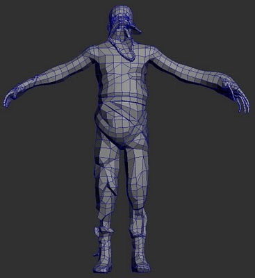
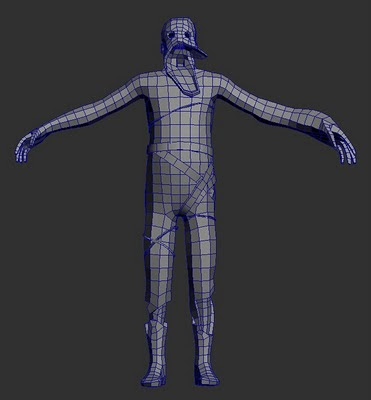
The basic mesh created before importing into Zbrush. (Click to enlarge.)


When the the base modeling was done, the mesh was taken into Zbrush for a sculpting pass. The purpose of the sculpting pass is to create details that can be projected on to the final in-game mesh to make it look more detailed than it really is. Since the proportions and general shape where already defined on the base-mesh these should not be changed too much and mostly only minor details were added.

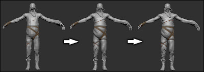
All the separate parts of the base-mesh where imported into Zbrush as separate sub-tools. This made it easy to hide, show and mask parts off. It was also possible to assign different materials to the separate parts as a visual aid. In Zbrush the mesh was subdivided several times giving me more polygons to work with. Once there was enough polygons, new details and shapes could be added by pulling, pushing and using other various tools, almost as if it was a piece of clay.


The different subdivision levels in z-brush. (Click to enlarge.)


When the sculpting was done the lowest subdivision level was exported in obj-format to use as a starting point for the final low-polygon in-game mesh. The reason to make a new low polygon mesh and not use the mesh from sculpting is to optimize the number of polygons in the final mesh. This can be very important for performance when added in the game. The mesh used as a base when sculpting has a a relatively uniform tessellation (distribution and a size of polygons) and mostly a quad layout of the geometry (meaning that most polygons are four sided). The in-game mesh then had to be modified to only have geometry where it was needed. By doing this, more details could be added where really needed without decreasing any performance of the final mesh. This process is sometimes called retopologizing and can be done several different ways. Some people like to use the specialized retopologizing tools within Zbrush, but I personally like to use the regular modeling tools in my 3d software.

The final version of the low polygon mesh. (Click to enlarge.)


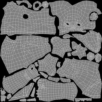
When the modeling was done it was time to create the uv-map. A uv-map is basically a way to show where parts of model belong on a flat surface, the texture. This is called a projection, and in this case a 3D to 2D one (the model is in 3D and the texture 2D). Unless the 3D object is a very simple one (like cube or plane) this is a very tricky operation and it is almost impossible to maintain the same ratios as on the model. A good example of this is to look at the various ways our planet earth (a 3D object) has turned into maps (a 2D surface) and all of the distortions and/or strange layouts that follow.

There are some conventions that should be followed when laying out this uv-map. The most important is probably to make sure to put seams (places where polygons split up during the 3d to 2d projection) in places where they are not very visible. This since it is often very hard to match up colors of pieces not next to one another on the texture. Seams can also mess up shading when using normal maps. On a humanoid character a good place to put them could be on the inside of the arms and legs for example. This character also have some irregular areas that have to be given some extra thought. For example the head had an unusual shape making the uv-mapping extra tricky. Once the placement of seams in the uv-map have been established the chunks where laid out to maximize the use of the texture space.

The uv-map layout. (Click to enlarge.)


Before starting the actual texturing work I generated colors for some of the texture maps from information in the high poly mesh. The textures produced this way were the normal map and an ambient occlusion (AO) map. The normal map gives the mesh some extra detail and makes it seem like it is made up from more polygons than it really is. The AO map was to be blended into the diffuse (the base color) texture to give a greater sense of detail and form. Basically, AO is a calculation of how much light reach each point on the mesh, making creases darker and pointy details brighter.

The diffuse map represent the base color of the character and was created in Photoshop by using a mix of various photos, custom Photoshop brushes and the previously mentioned AO map. The diffuse map was extra important as it was also used as a base for creating some other maps like the specular and gloss map. These two are black and white maps that control how light will affect the model. Specular determines the strength of shininess on an areas and gloss how sharp the shininess is. Some of the detail in the diffuse was also used to add extra details in the normal map, like wrinkles and scars.

The final normal, diffuse, specular and gloss maps. Notice that all use the uv-map layout as base. (Click to enlarge.)


Once the texture was completed, the model was ready to be used in-game!

Renderings of final model using different setups of texture maps. (Click to enlarge.)


It's Alive!
By Thomas Grip (Frictional Games)

Before the model could be used in game, some other things was required. First the model needed to be rigged and skinned, a process where the mesh is connected to a skeleton. This skeleton then need to get animations and not until that was done where we able to get a it into the game. This job was made in part internally and partly by an external company. There were a lot of job put into this, but is unfortunately outside of the scope of the article. To some sum things up: we got the creature moving and it was now time to put inside the game.

For Amnesia: The Dark Descent we use a proprietary engine called HPL2 which is a vastly improved and revised version of the engine that powered the Penumbra games (although quite old now as we are developing version 3 of the engine for our upcoming game). It uses a rendering algorithm called deferred shading at its core, a technique that is very useful when rendering lots of lights. It works by drawing out the the normals, depth, specular and diffuse colors to separate buffers and then use these to calculate the final color of a light. Normally when drawing a light, all models that intersect with the light needs to be found and then redrawn based on the light's properties. The nice thing about deferred shading is that models are only need to be drawn once, saving tons of rendering time and allowing more predictable frame rate.

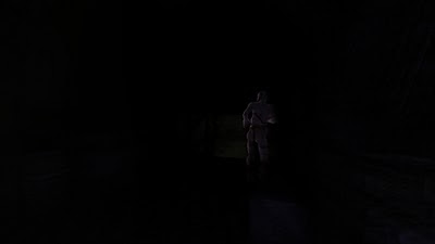
Amnesia: The Dark Descent can be a quite dark game in places, sometimes making it hard to see enemies properly. To remedy this we added a rim lighting algorithm that made the creature's outline light up when in dark areas. This proved extremely moody and when walking in dark passages the player could suddenly get a glimpse of disturbing silhouette slouching off in the distant. After this final touch, our creature was ready to frighten unknowing players!

In-game screenshot showing of the rim-lighting on the creature. (Click to enlarge.)


Hopefully this article will give you some insight into the work that it took to create an enemy for our game. It was quite a long process and took several months from idea to finished asset but we think the final result is well worth it!

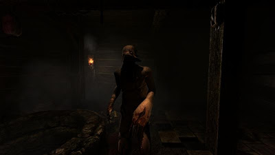
An in-game screenshot of the final rigged model in a scene. (Click to enlarge.)

Thursday, March 17, 2011

Birth of a Monster. Part 1.

(The following was supposed to be an article in a Russian magazine, but was never published. So because of that, I decided to post it on the blog instead. It was written in June 2010 by myself, Jonas Steinick Berlin and Olof Strand. Jonas and Olof were working as contractors for Frictional Games at the time. )


Creating Unspeakable Guidelines
by Thomas Grip (Frictional Games)

The following article outlines the process of creating a creature model from scratch for our first person horror game Amnesia: The Dark Descent. It will go through the basic thinking that went into the design of the enemy, how the concept images where made, how the mesh was built and finally how it was put into the game. For this work we used two extremely talented external artists and they have themselves outlined how their horrific creations came about below and it a future part. Before moving on to their work though, I will detail the thinking that went into the basic design of the creature.

When creating a horror game, making sure that the antagonistic creatures are properly designed is an extremely important issue. One wants to make sure the player faces something that feels frightening and works with the game's atmosphere and story. Another important aspect is to make sure that the enemy fits with gameplay. Certain movements might be required and it needs to fit, size-wise, into certain environments and situations. Finally you need to make sure that it is within the constraints of the available resources, something that is really important for small company such as ours. Having these three guidelines in mind I will now walk through the process of coming up with the core requirements for the enemy codenamed “Servant Grunt”.

My favorite way to go about when creating a creature is to take something normal and then add a disturbing twist to it. I also wanted some kind of character that the player could easily project agency to and believe it has motivations, imagining it more alive than it might actually be. Because of this I decided that we use some kind of human or at least humanoid entity, which is a shape that is easily recognizable (no other animal walks like a human) and which we all assume have feelings, desires and motives.

The problem with having a creature which gets the characteristics of a human projected on to it, is that the player will also assume it is intelligent. Because game AI is notorious for doing stupid things, this could easily break immersion. Having enemies do simple tasks like opening doors, avoiding obstacles and investigating strange noises in a believable human-like way is very hard to do. Hence, we had to have something in the design that hinted of stupidity, making it part of the immersion were the enemy to do something silly. Usually this means making something zombie-like, but I really did not want have something that cliché. This mean that I wanted the creature should look and feel stupid, yet still be as far away from a zombie as possible.

Avoiding clichés is usually something that ones does to keep things fresh, but in horror games a lot more is at stake. It is vital that the player does not feel familiar with the dangers faced as it drastically decreases fear and tension. It is when we are unsure about something and not able to predict or makes sense that true terror really emerges. For example, when building one of the game's maps, there was a vast difference in perceived horror between using an old, familiar enemy model from Penumbra (our previous game) and the new one discussed in this article.

Gameplay-wise the main constraint was that it had to walk in some human-like fashion and not crawl or move on all fours. This because we wanted to have a base collision that could easily fit into a cylinder, making it easier to code. For the first Penumbra game, we had dogs as the main enemy which, because they where four-legged, caused tons of issues. Something we wanted to avoid that this time around. Making sure implementation of the enemy is simple ties into saving resources. It was crucial that we did not want to have too many unknown factors when making the enemies. By making sure that most of the game's elements where familiar to us, we could much easier assure that we kept to the timetable and could spend time on polishing other parts of the game instead of trying to find AI bugs.

It was actually not until all of the above was determined that I started to figure out the story behind the creatures. This is not always the way we do it in our games, but this time it fit very well. Our basic story designs only referred to the enemies as “the servants” and did not talk much about their appearance or where they came from, so I had a lot of freedom to make a fitting background story to the guidelines. The finalized idea was that these “servants” were actually beings from beyond that had been summoned into bodies of humans. Once inside humans, they did their best to deform the host into a body that they are used to control, shattering bones, tearing flesh and producing cancer-like growths. This in turned resulted in a scene where the player witness how some humans under great pain are taken over, showing how designing graphics can shape the story, as well as the reverse.

With these basic guidelines completed, I contacted Jonas to start on the concept art.


Conceptualizing the Horror
by Jonas Steinick Berlin (pudjab [at] hotmail [dot] com)

Thomas gave me almost full creative freedom. The basic guidelines were that it had to be a humanoid and nothing like standard zombies, "The Infected" in Penumbra: Black Plague or the creatures in Dead Space. It should also fit the the story of demon-like creatures taking over human bodies and be super creepy. Apart from that, I was free to do pretty much what I wanted.

This was my first character design for a commercial game, so I was a little bit shaky. The great freedom was both exciting and quite overwhelming. So many choices! I first researched and got inspiration from unusual anatomy, photos 18- and 19th century clothing (the time in which the game takes place), surrealistic paintings and various disturbing stuff.

I then continued brainstorming and did a lot of small quick sketches of character silhouettes and different faces. I really wanted to avoid stereotypes and do something unique and memorable. Every single doodle got assembled on a collage and I then showed it for Thomas. He said which parts he liked and from that I went on and created something more detailed. At this time I had a design in my head that I really felt would be perfect. I drew it down with details, colors and lots of love. The result was something of a hunchback with interesting clothing fitting the era and a really grim face. This is perfect I said to myself! Excited I showed it for Thomas. However, I quickly got knocked down to earth again when he said that it looked too funky and resembled “Grodan Boll” (which is a character from a Swedish children's book taking the form of frog). I got instructed that I should avoid the cartoony style and make something more realistic, something that you almost could find in real life. Thomas also thought that it should have a lot less clothes.

The first batch of sketches. Contains the infamous “Grodan Boll” (“Frog Ball”) on the right. (Click to enlarge.)


After this setback I started putting a lot of attention on the head of the character. I think this is the part of the human body that you can make the most disturbing because of the emotions it can show. I instantly chose to give him a crushed jaw with parts of skin hanging down and eyes with dilated pupils which pointed in different directions. Thomas approved of this and I moved my focus to the rest of the body. Important here was to get the feeling of a demon possessing a body that it was unfamiliar to. The creature should try to deform the body into a, according to its own twisted standards, more familiar form, breaking bones and bending joins while doing so. It should also have accidental injuries and be held together with bandages and ropes.

The create is starting to shape up and the design of the head has been approved. It is not yet decided what to do with the lower jaw though (an issue discussed until the very end). (Click to enlarge!)


Because of the lack of clothes we had a discussion about showing genitals or not, but soon scrapped that idea after we realized that it would be best not to tease the rating systems too much (this turned out to be a non-issue as other part of the game show /Thomas).

Clothes have been determined to be nothing but a few bandages. Also started studying how the head might look viewed from the side, which turned out to be not a simple task. (Click to enlarge.)

One thing that was hard to decide was the final look of the left hand. It had to be deformed in some way, but yet be usable and able to be used as a weapon. I did at least 10 different arm designs before coming up with something that we could use. For example I did an arm in the shape of snowballs with spider fingers and one arm twisted in a spiral, with its bones pointing out. The final hand-design was more of a claw with bony fingers that we thought would be perfect for both scaring the player and give a good scratch on the back.

Before settling on a final design, many different version were tried. The left arm was the most troublesome part and changed a lot. (Click to enlarge.)


When I did the detailed final concept I started by drawing it up traditionally with a pencil. This may not be the most effective way to work (because it makes it harder to do big changes and also caused unwanted coffee stains), but I feel more in control this way and find it easier to do the smaller details. After that I scanned it and quickly colored it in Photoshop using multiply layers. I first tried a bluish skin tone, but it made it feel too much like an alien, so I changed it to a more desaturated one, warmer colors with elements of purple, blue and yellow to create a pale corpse-like look. At this point it didn’t feel too professional and had to go over the concept with Photoshop to add the final touches, such as highlights, noise removal and sharpening. The Photoshop-file ended up having forty plus layers, most of them containing small and unnecessary changes. Nothing I recommend, because of the insane file size, but this time it did the trick and I managed to convince Thomas the concept was completed.

The art was now done and could now be used by the modeler to create the actual 3d asset.

This was the final sketch of the enemy. After this was done I started painting it digitally. (Click to enlarge.)


Final concept for the enemy. Note how the lower jaw has been removed, something that was made after the entire character was fully colored.


Continue to the second part...

Sunday, March 13, 2011

Counting on Monsters

You can Count on Monsters is a completely novel children's book by Richard Schwartz. It is a little hard to describe by NPR does a great job here. Schwartz is a mathematics professor and his goal was to teach young kids deeply about prime numbers. That requires a lot of knowledge -- particularly, of multiplication and division as well as the notion of an integer. My 10 year old read the book with my 6 year old. They both loved it. I think the notion of monsters being able to eat one another in a hierarchical fashion did the trick in a sort of 'circle of life' way. The 10 year old even mastered the 'advanced theorems' at the end of the proof including Euclid's proof that there are an infinite number of primes. To say that this might make a great iPad app is an understatement. The book was in the Top 5 best-sellers on the NYT's a few weeks back but I gather they have had supply issues.
While I am on the subject of learning maths, I thought I'd point to a program all of my kids have been doing for the past year here in Boston: The Math Circle. I gather it is offered at other places around the country as well. Basically, they teach kids from age 5 maths using 'chalk and talk.' This is not some dressed up maths or times tables but principles of geometry, topology and real analysis. And it works and is the most engaging learning experience our kids have ever had. The Harvard professors at the heart of this program -- Robert and Ellen Kaplan -- were on NPR this week talking about their new book.

Parentonomics. For kids?

That was the title of an email I received this morning from Austin Frakt, an economics professor at BU:

Reading your book, Parentonomics, now. Where appropriate for my 3.5 &a 6.5 year olds I read them lightly edited passages. They love it! They can relate to the experiences and struggles with their parents over food, sleep, etc. I then ask them questions like, "Did the daddy and mommy do the right thing?" "What else might they have done?" "Did this ever happen to you?" And so on.  
It's a big hit! 
Ever consider turning it into a book that parents can share with their kids in precisely this way? Why can't children learn about economics concepts in the same fashion? An interesting idea, I think.
Can children learn economics from parenting decisions? Of course, I am precisely the wrong person to answer this question at least insofar as the book might be of help. My kids at various times have picked up the book and then told me that it was pretty boring because they already knew all that. They are referring to the stories and, to be fair, they did live them. 

As a book for kids? That is something that has never occurred to me and I'll have to ponder it further. (If there is any publisher out there for which this idea gels, call me).

But Austin's experience was interesting and perhaps it may work if you want to teach your kids some economics. If you have similar experiences, feel free to let us know in the comments.

While I am at it, anyone interested in health economics should check out Austin's blog, The Incidental Economist. It's on my Google Reader. In fact, I enjoy Austin's musings outside of health economics as much as his commentary on health policy.