Monday, November 30, 2009
Why Horror Games Suck!
I also want to point out that the Penumbra games all have their share of flaws from the stuff below and are by no means exceptions from the rule. However, it is always a start to notice what kind of flaws that exist, so that one can work upon fixing them. It is our goal that our upcoming game Amnesia will minimize on these sucky aspects! Now that I have lined up the mistakes, it would be quite stupid to step into them.
Control is taken away when things get scary
"The protagonist enters a seemingly empty room, starts looking around when suddenly a strange sound is heard from outside. Something is about to enter and it's time to hide. At this point the game removes the player's control and a cut-scene is started showing how the protagonist hides and just barely manages to remain unseen by the approaching monster."
This is a very common situation and I have seen it in just about every horror game that I have played. Just about when things are about to get really scary, the player's control is taken away. Why does this keep happening in games? It's been over 10 years since Half-Life skipped having cut-scenes and it seem rational that all horror games should be using this approach by now.
I think the major reason for still using cut-scenes like this is because a certain scenes requires "special moves" (like hiding) from the protagonist and/or will lead to a strange situation if the player does play along (tries to kill the approaching monster or similar). This does not mean that the cut-scenes are needed though and scenes can be rewritten or game mechanics can be changed to make it work. It is also possible to allow players to do really stupid decisions as long as they has been given a fairly good hint on what a good action would be. If some of the players insist on walking up to the man seen butchering his victims then just put them up against him in an unwinnable fight. Next time they should be a lot more careful...
Another reason for designers to add cut-scenes is because they do not want the player to miss something. In horror games this could mean a shadow briefly seen in the distance or similar. Often this is very sloppy design and some simple changes can make the shadow almost impossible to miss. Let's not forget that it is an interactive medium either and it is often trivial to add some line-of sight check and activate the shadow when the player is actually looking in that direction. Sure, a small percentage of the players might miss it, but that is something one has to live with when working in an interactive medium.
If one needs to have a cut-scenes in a horror game, then make sure not to have it during the actual horror segments. Doing that is like having Mario enter a cut scene when he is about to jump from one platform to another.
Combat is designed to be fun
Many horror games are fairly combat oriented and because of this a great deal of design time is spent making sure that combat is fun. If players will spend a lot of time killing stuff, is it not reasonable to make the combat fun? Unless the goal is not to make a really scary horror game then the answer to this is "NO".
If fighting the monster is the best part of the game, then this what players will want to do. In horror games, where enemies almost always are the main mechanics for making the player scared, this approach is counterproductive. Players are supposed to fear the monsters, but if killing them is what makes the game worth playing then enemies are bound to be a lot less scary. If one gains positive feedback whenever an enemy is encountered then approaching sounds might give a reactions like: "Oh, that might be an enemy! Goodie!". This is of course the completely opposite of what a horror games strives for.
But if combat is not "fun", then will it not be boring, meaning that the game will be boring too? I would like to answer this with a loud "NO" this time too. First of all, combat can be "unfun" for many different reasons and some reasons are better than others. For example, the combat still needs to be pretty fair, responsive and not feel too frustrating. A good way to make the combat feel unfun is by resources, an example being System Shock 2 where ammo is very sparse and weapons will degrade (and eventually break) whenever used. In Silent Hill (the older titles anyways) combat use responsive controls but aiming can be imprecise and a bit clumsy, making it feel more like a last resort than the basis of fun in the game.
These examples have their own flaws, but point at least in the right direction. Also, with all the problems that combat give rise to, one might consider skipping it altogether. Even though it might be hard to believe, violence is not the only way to drive gameplay...
Overusing the same enemy
Usually a monster in a horror game has some kind of spooky encounter at which they are quite frightening, but then an hour into gameplay, they have become cannon fodder. For some reason, designers seem to think that all hope is lost after this encounter and that they might as well scatter thousands of copies into the rest of the game. Or perhaps they think that if it was scary once it will be scary every other time too (embarrassingly, I am guilty of this myself in the past). Horror is tightly connected to the unknown and if something becomes too familiar then the impact that it first had will be lost. This means that for an enemy to remain scary, the way it is presented needs to vary and the player can not be exposed to it too much. Players will eventually learn patterns, what to expect and the moment this happen, pretty much all scariness connected to the enemy is lost.
I think the main reason that this flaw is present in just about every horror game is because content is so expensive and time consuming to make. Players need to have something to do when playing and the easiest way to do this is to scatter enemies around the levels. This is far from good horror design though and just leads to repetitive and predictable gameplay instead a truly frightening and engaging experience.
The monster is always shown
A well known fact in horror is that the audience's own imagination is the greatest asset. It allows the horror to be more vague and people to project their own fears into the experience. Because of this, many books and movies keep the monster hidden in darkness, not revealing its true form until the very end or not at all.
In games it is quite different. Sure, before a monster is shown there can be shadows and strange sounds, but as soon as it comes into play it's there in full high-poly detail (preferably with lots of slime and/or gore). It seems like horror games are way too anxious to show of the monsters and there are extremely few games that uses an unseen enemy as a gameplay device (and not just some foreboding ambient piece). I suggest that games should add proper gameplay mechanics to an unseen monster and if possible even refrain from showing it at all!
Some might wonder how an enemy that is not seen can affect gameplay, if it can hurt the player, surely it must be visible? I do not think this is needed and in Penumbra: Black Plague we had an enemy that was entirely sound based and never shown in the game. It was far from perfect and had a plenty of flaws but it is at least a step in the right direction. If horror is to reach new levels in games, the fear of the unknown must be used to the fullest!
The horror is slapped on as a side thing
The final reason why horror games suck sort of tie in to all of the above. For some reason it almost always seems like the horror is an afterthought in games. First the game main gameplay design is made (third person shooting, Myst-like puzzle adventure, etc) and then some kind of horror theme is slapped on top. Surely this is not the way horror games are designed, but to design the gameplay mechanics without considering the horror aspect seem fairly common. FEAR is the dictionary example of this where the horror elements are clearly separated from the main gameplay in a very obvious way. The player goes through a section of John-Woo-like shootouts and then after that is a horror section where a scary girl shows up or similar. It soon obvious that these scary sections never pose any threat to the player and the horror factor is greatly decreased. The combat also does nothing to increase the horror, instead it just lessen it by making the player feel everything but vulnerable as wave after wave of enemies are mowed down.
This divide in design is present in pretty much all games though and a lot of the gameplay is designed in isolation from the horror elements (as mentioned above, the most common thing is the entire combat system). I think this problem is fairly common in other games genres too. Instead of trying to combine the gameplay with the story told and feeling that are to be evoked, they are designed separately and then forced together. If games are to reach new heights in terms of telling stories and being emotional than this needs to be improved upon. One can not see the game as a story part and a gameplay part, but have to realize that they both need to support each other.
Until this happens in horror games (and other genres too) they will continue to suck*.
*or at least not be as good as they could :)
Friday, November 27, 2009
Horror Tip: Korsakovia
Type: Game (Half Life 2 Mod)
Link: Mod DB page (info + download)
Masterminded by the same guy that made Dear Esther is a highly experimental horror game about a man with Korsakov's syndrome. Its tag line goes:
"The paramedics report that they were unable to find his eyes. We think he may have eaten them."
If you like me find that awfully intriguing then go on and play the game now and read the rest of the post later!
I have put up posting a horror tip for Korsakovia for quite a while because of the simple reason that I have not been able to complete it! I have still not managed to do so, but thought it was time to make a post about it anyway. My inability to complete it highlights the strength and weakness of the game quite well: First, the game is quite demanding on your eyes and ears with a dark environments and extremely unnverving sounds at times. Secondly, the game is frustrating as hell as it is hard to orient oneself in the similarly looking environments and some gameplay parts are very unforgiving.
As said above, and different compared to Dear Esthter, Korsakovia has actual gameplay elements consisting on bashing (or avoiding) monster and some annoying first person platforming. Especially the platforming feels quite unfair and is awefully frustrating to the point where the otherwise excellently built-up atomsphere goes away. I feel that the game would have been a lot better without any of this gameplay and experiencing this makes the game extra interesting to play. It clearly shows how the player's attention diverts from being immersed to focusing on the game's mechanics when gameplay gets too frustrating.
What really shines in Korsakovia (and made me play it as long as I did!) is the haunting atomosphere and the script consisting of the protagonist talking to his doctor who may or may not be real. The game is quite abstract and there are no clear goals or motivations, yet it managed to captivate me and want me to play more. This also makes the game an excellent experiement in player motivation, as it differs quite a bit from other games. Finally, as noted above, the game is quite hard on the senses and is far from a fun experience, proving the point that games do not have to be "fun" to be engaging. Note that these "brain-fuck"parts of the game where not what eventually made me stop playing; it was the combination of that and the bad gameplay. Had the gameplay been more streamlined and solid, I am sure I would have played to the end.
In conclusion, Korsakovia is very interesting game from a design perspective and I urge you all to play it as long as you can stand it. However, from a gameplay experience stand-point I think it fails, mainly becuause of some unfair and extremly frustrating sections.
To play it Half Life 2 - Ep 2 is needed (I do not think the normal hl2 works). Download the zip and extract to "steamapps\SourceMods". Then start the game through steam.
Mandelbulb comes to Mac!
Get it here:
http://frictionalgames.blogspot.com/2009/11/fractional-fun.html
As with the Linux version, Edward Rudd is that man behind the port.
If you like it, please spread the word!
Important note:
Because of some strangeness with Nvidia osx drivers, the program is unusable on some Nvidia cards. 7300 GT under Leopard under leopard is know to have this problem, and there might be more.
Thursday, November 26, 2009
Mandelbulb explorable in Linux
All this has been possible because of our Edward Rudd who makes all porting for Frictional Games.
Download link and stuff in this post (scroll to end):
http://frictionalgames.blogspot.com/2009/11/fractional-fun.html
If you like it, please spread the word :)
Mac version is also in the works and will come very soon!
For those wondering where all development and horror related post are, then I promise there will be some of that very soon! Got plenty of horror tips to share and more :)
Thursday, November 19, 2009
Cold, Clothing and Fatality Risk
Tuesday, November 17, 2009
Been there
Fractional Fun
This blog post will not be totally game related, but more about the engine and a recent obsession of mine. Do not fear though! It should hopefully still be interested and I will also provide some nice images! Hopefully it will also be able to evoke a sense of wonder too. Read on to find out!
Ten years or so ago I wrote a paper for school about Fractals. These constitute a large variety of objects but what they all have in common is that they have several levels of self similarity. Nature consists of tons of fractals, for example trees and mountains. In games the term fractal landscape was quite common at time and was a way of generating terrain. Although not heard of as much today it is still a part of game making. Below are some examples of fractals, note how the same type of shape appears over and over again:
Now, while doing the paper for school I came across a weird thing called the Mandelbrot Set. This is a certain function that when iterated and mapped (drawn to screen) creates a fractal. The function for the set is very simple and is based around this formula:
N(0) = c N(n+1) = N(n)^2 + c
What this means is that one starts of with a number c, then multiply by itself and finally add c to get the next number in the sequence. If done with normal numbers, one gets something like this:
1 + 2 + 5 + 26 + ... and so on towards infinity
However, there is a twist to this formula when creating the Mandelbrot set, instead of using a normal number for c, a complex number is used. A complex number has a real and imaginary part and is written like this: c = 3 + 2i (the imaginary parts gets i behind it). When using the above formula on a complex number, it gets slightly more complicated and is (kinda) analogous to a 2d vector being rotated by itself.
Now, to get the Mandelbrot set, one "simply" checks if a certain c makes N go toward infinity or not. If it it does not, then it is part of the set. In practice one just iterates (does the same thing over and over) the formula a fixed number of times and see if it has reached a certain limit value. If it has it is said to be not part of the set.
Hopefully the math part made sense and was not too boring, but I felt it was needed for full understanding of what makes the Mandelbrot set so amazing. And to see why it is amazing one has to visualize it. This is done by letting c be a point on the screen where the x coordinate is the real part of the y coordinate the imaginary. Then one colors the pixel black if it is part of the set, and if not color it depending on how many iterations it took to reach the limit value. Doing so will generate this picture:
It gets even better still! If one zooms in on this image, the details just keep coming and they never repeat! As with the other fractals same kind of shapes return again and again, but never in the exact form. The beauty of it is breathtaking! Here are some examples of zoomed in parts:
Fast forward to present day. Last Friday Luis sent me a link to this page of someone who managed to create a 3d version of the Mandelbrot set. Naturally this was irresistible for me and inspired by the works of Iñigo Quilez (I had his presentation "Rendering World with Two Triangles" as a reference throughout this project) I set out to create a real time application that could explore this world .
My idea was to use some kind of ray tracer to render out depth, then use that depth to generate normals and just plug that into the deferred shader and let it add ssao, nice light and fog. I thought about this for a while and came up with the idea to use the same method as when rendering high quality parallax. This technique is called relief mapping and works by first making a rough linear search for an intersection and then a binary search to pin the exact location down. Hopefully this would prove fast enough to do a nice 3D Mandelbrot in real time! What I ended up with was an algorithm that could render arbitrary mathematical functions, so I tested this on some functions and got pretty nice results:
Some metaballs rendered and animated. This is not the fastest way to do this, but proved that stuff worked!
What was left now was to attack the Mandelbrot set! The formula for getting hold of the 3D version is a little bit different from the 2D one and is not really THE 3D Mandelbrot either, but it surely the closest I have seen! It was discovered by Daniel White and works by using spherical coordinates. Remember how I said that the 2D Mandelbrot formula was kind of like rotating a vector by itself. Well, in the 3D version one rotates a 3D vector around itself by using spherical coordinates instead of polar (skipping formula, but if anyone is interested I can give more details!). Also, to make it look good in 3D, one has to have a power of 8 in the formula, meaning that one spins the coordinate around by itself 8 times!
It took quite some time get this working as the 3D-card did not do what I want to and so on. But finally I got it all working and boy was it worth it!!! Here are some screens:
Once I got this far I could not stop using it! It was so much fun exploring the weird world of the 8th degree Mandelbrot fractal! Because of some limitations in the ray tracing method I added a new version of the renderer that builds up the image in slices and can use a lot more iterations when checking if it is in the set or not (more iterations = more details). It is slower, but creates more details in the images and it is fun to use it when one discovers some extra interesting shape and want it enhanced. Here is a video of me exploring the set:
Now the best of all this is that YOU can explore this strange world yourself! To do so, just download the MathFuncRenderer and get going! (ShaderModel 3 capable card required) Windows, Mac and Linux version below.
Note that you need OpenAL installed for it to run. Get that here:
http://connect.creativelabs.com/openal/Downloads/Forms/AllItems.aspx
Winodws:
http://unbirthgame.com/MathFuncRenderer.zip
(Link might change so please do not hotlink)
Linux:
http://unbirthgame.com/MathFuncRenderer-Linux.zip
(Link might change so please do not hotlink)
Mac:
http://unbirthgame.com/MathFuncRenderer-Mac.zip
(Link might change so please do not hotlink)
(Also note that because of some nvidia driver issues in OSX, some nvidia card will not work properly, 7300 GT on leopard is known and there might be more.)
I am very anxious to see what kinda of strange pictures you all can take so have opened up a post for this in the forum. I have already posted more of my own images there.
http://www.frictionalgames.com/forum/thread-3044.html
Monday, November 9, 2009
The struggle between Light and Dark
Of course one cannot just turn off the lights and hope to make a scary game. The player still need to be able to see something, as watching a pitch black image is not all that exciting. The appropriate amount of light also depends on the type of environment and the type of events that will take place. If the environment is very large, then it might need to be brighter, whereas smaller rooms, where it is easier to navigate, can be darker.
Added to this the player is usually equipped with some kind of lantern or flashlight to help illuminate. In Amnesia (and the penumbra tech demo) the player has a vague light around her to help make the closest surroundings more easy to see. Penumbra Overture and Black Plague had a large blue help light when sneaking in darkness, although this had the problem of illuminating too much. Finally another trick is to add "fog" that gets blacker the longer the distance and this gives a the darkness a more thick and oppressive feel. This was used to great effect in the first Silent Hill game and gave the added visual effect of enemies emerging from the darkness a head of you.
Once starting to implement this, a huge problem appear: Darkness is Subjective! This means that a certain area willseem to have a different light level depending on who plays it and how it is played.
The first problem comes from the monitor itself and depend on:
- Light level of the room.
- Settings on the monitor.
As implied above, I think it is essential to have a good light level setup screen for a game (and would like it for movies). For Penumbra we had an in-game gamma value that could be tweaked and also a test image to calibrate against. There were however two large flaws here. First of all the judgment required ("Make this screen barely visible") is a highly subjective! Instead we should have had some simpler and more accurate test and in Amnesia we will have two squares of different light levels, where one should be visible and the other not. This is far from perfect, but avoids some of the extra subjectivity. Secondly, gamma is not all there is to it: changing the contrast makes a large difference and can make the calibration image fail. There is also the actual brightness to be change which of course also make a large difference. To make matters worse these three values (gamma, contrast and brightness) affect each other too.
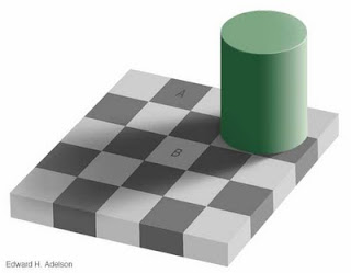
The problems does not stop there though! It also turns out that the apparent light level changes depending on the light environment it is in. This illusion clearly illustrates the point:
Although it is hard to believe, the squares A and B are of exactly the same light level! A game example of this is in Silent Hill were the background light level looks much darker when the flashlight is off than when it is on. This means that when you setup your monitor to look good when flashlight is on, it looks too bright when it is turned off. The game developers should actually have decreased the ambient light when the flashlight was off in order to give the best effect. Another example is how a game can look much darker when running in windowed mode because of a brightly colored desktop image (note: windowed mode usually do make a game objectivly darker, but this problem can add to the effect).
So how to solve this struggle between light and dark? For developers it is important to always check a settings screen and adjust gamma before testing the lighting in a level. And to do this properly there must off course be good tools for doing just that. Another important thing is to always try the light level of a map in different ways. How does it look when the flashlight is on, when it's off, what happens when the fog comes rolling in, etc. Changes in the environment and gameplay can greatly affect the perceived darkness which in turn can have great effect on the game's ambiance.
It is also upon the players to make sure that they set up properly before playing. I have read several reviews where the reviewer claimed that the game was too dark and one can wonder if they really had set up properly. One can also wonder if the makers of the game gave proper direction on how a good set up would be like! There needs to measures taken on both sides to assure that a game can reach its potential to frighten.
How do you go about with setting up monitor gamma and so on? How much thought have you given this in the past?
Friday, November 6, 2009
Sorting out books
"2001. This book is 8 years old."
"Well, actually, that book is much older. It is so old that 2001 was, in fact, the far future."
"What is it about?"
"It is about a time where we could travel into space and to the moon base and beyond."
"Umm, I think that is still the far future. Maybe it should be called 2039 or 2040."
We'll see.
Thursday, November 5, 2009
The dull side of it - Part 1.
Wednesday, November 4, 2009
There is bad luck ...
Tuesday, November 3, 2009
The second most intelligent life form
At the Institute for Marine Mammal Studies in Mississippi, Kelly the dolphin has built up quite a reputation. All the dolphins at the institute are trained to hold onto any litter that falls into their pools until they see a trainer, when they can trade the litter for fish. In this way, the dolphins help to keep their pools clean.
Kelly has taken this task one step further. When people drop paper into the water she hides it under a rock at the bottom of the pool. The next time a trainer passes, she goes down to the rock and tears off a piece of paper to give to the trainer. After a fish reward, she goes back down, tears off another piece of paper, gets another fish, and so on. This behaviour is interesting because it shows that Kelly has a sense of the future and delays gratification. She has realised that a big piece of paper gets the same reward as a small piece and so delivers only small pieces to keep the extra food coming. She has, in effect, trained the humans.
Her cunning has not stopped there. One day, when a gull flew into her pool, she grabbed it, waited for the trainers and then gave it to them. It was a large bird and so the trainers gave her lots of fish. This seemed to give Kelly a new idea. The next time she was fed, instead of eating the last fish, she took it to the bottom of the pool and hid it under the rock where she had been hiding the paper. When no trainers were present, she brought the fish to the surface and used it to lure the gulls, which she would catch to get even more fish. After mastering this lucrative strategy, she taught her calf, who taught other calves, and so gull-baiting has become a hot game among the dolphins.
Sunday, November 1, 2009
The Haunter Of The IGF
At the start of the next year we will see if we managed to get nominated! In case you are wondering, Penumbra Overture entered the 2008 competetion (no nomination) and Black Plague did not enter in 2009 because we had financial backup from a publisher (i.e. not indie). Now that we are back as full indie we can enter again!
Now its back to work again!