 When making a horror game an important ingredient is the darkness. When in a dark place people tend to be more easily spooked and have a more vivid imagination, a genetic heritage passed on from our ancestors who were hunted by predators at night. Taking advantage of this is important and just changing the light level of an environment can make a huge difference in the scare factor.
Of course one cannot just turn off the lights and hope to make a scary game. The player still need to be able to see something, as watching a pitch black image is not all that exciting. The appropriate amount of light also depends on the type of environment and the type of events that will take place. If the environment is very large, then it might need to be brighter, whereas smaller rooms, where it is easier to navigate, can be darker.
Added to this the player is usually equipped with some kind of lantern or flashlight to help illuminate. In Amnesia (and the penumbra tech demo) the player has a vague light around her to help make the closest surroundings more easy to see. Penumbra Overture and Black Plague had a large blue help light when sneaking in darkness, although this had the problem of illuminating too much. Finally another trick is to add "fog" that gets blacker the longer the distance and this gives a the darkness a more thick and oppressive feel. This was used to great effect in the first Silent Hill game and gave the added visual effect of enemies emerging from the darkness a head of you.
Once starting to implement this, a huge problem appear: Darkness is Subjective! This means that a certain area willseem to have a different light level depending on who plays it and how it is played.
The first problem comes from the monitor itself and depend on:
- Light level of the room.
- Settings on the monitor.
As implied above, I think it is essential to have a good light level setup screen for a game (and would like it for movies). For Penumbra we had an in-game gamma value that could be tweaked and also a test image to calibrate against. There were however two large flaws here. First of all the judgment required ("Make this screen barely visible") is a highly subjective! Instead we should have had some simpler and more accurate test and in Amnesia we will have two squares of different light levels, where one should be visible and the other not. This is far from perfect, but avoids some of the extra subjectivity. Secondly, gamma is not all there is to it: changing the contrast makes a large difference and can make the calibration image fail. There is also the actual brightness to be change which of course also make a large difference. To make matters worse these three values (gamma, contrast and brightness) affect each other too.
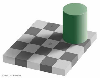
The problems does not stop there though! It also turns out that the apparent light level changes depending on the light environment it is in. This illusion clearly illustrates the point:

Although it is hard to believe, the squares A and B are of exactly the same light level! A game example of this is in Silent Hill were the background light level looks much darker when the flashlight is off than when it is on. This means that when you setup your monitor to look good when flashlight is on, it looks too bright when it is turned off. The game developers should actually have decreased the ambient light when the flashlight was off in order to give the best effect. Another example is how a game can look much darker when running in windowed mode because of a brightly colored desktop image (note: windowed mode usually do make a game objectivly darker, but this problem can add to the effect).
So how to solve this struggle between light and dark? For developers it is important to always check a settings screen and adjust gamma before testing the lighting in a level. And to do this properly there must off course be good tools for doing just that. Another important thing is to always try the light level of a map in different ways. How does it look when the flashlight is on, when it's off, what happens when the fog comes rolling in, etc. Changes in the environment and gameplay can greatly affect the perceived darkness which in turn can have great effect on the game's ambiance.
It is also upon the players to make sure that they set up properly before playing. I have read several reviews where the reviewer claimed that the game was too dark and one can wonder if they really had set up properly. One can also wonder if the makers of the game gave proper direction on how a good set up would be like! There needs to measures taken on both sides to assure that a game can reach its potential to frighten.
How do you go about with setting up monitor gamma and so on? How much thought have you given this in the past?